A Couple Shows & More Cutting
This past weekend I hit up the AGO to see The Great Upheaval: Masterpieces from the Guggenheim Collection, 1910-1918 which I thought was OK, and The Artist Project which was alright as well.
Artists I though had some cool pieces at The Artist Project were:


Progress Update
Here’s how far I am now on my stencil.

I didn’t have too much time to spend on it this past week, so I didn’t get as far as I wanted to be right now. It’s nice being at this end of the stencil because the larger the sections I have to cut out, the less time it takes me to cut a larger space. I’ve been watching quite a few art documentaries while I cut, so I might add a list to this blog next update. I’ve also been doing some super quick sketches of characters I dug when I was growing up. This is new territory for me. I drew fan art when I was a kid, but the older I got the more I got involved in design and just working on my own ideas.

They’re super rough but if you like, follow me on my instagram and I’ll add more as I go… they’re maybe not as you remeber them, but it’s my instagram so I can do what I want.
Later
My instagram: @Leitch
The New Old

As usual my latest painting is taking a crazy amount of time. In a previous post I said it was a new old painting that I was working on. It’s new because it’s my latest painting….it’s old, because I started it roughly 5 years ago. I’ve always planned to do this painting and the thought had never waivered on the subject matter.

Six years ago I started by painting the background, and then it sat leaning against a wall collecting dust. It’s going to be a red fox walking down a trail. I’m going to go about it much differently than I would have when I started. Chances are it would have look more like this piece.

Ink outlines, airbrushing, and a bit of oil paint on the details, all with the background comming through. My plan this time around is to cut a massive 2 colour stencil of the forest where the background will come through, and the fox will be solid oil paint and I’m going to make it as realistic as possible. In my head it works, will have to see if the two styles blend together enough and doesnt just look like one image sitting on top of another.
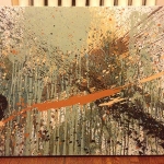
Here’s where I’m at with the stencil.


You can’t see much at this point but it should come together the more I get cut. I’m at about 40-50 hours of cutting in two weeks so far and I’m about a quarter done. The second stencil doesn’t have nearly as much cutting. It will probably equal the amount I’ve completed on this one, so that’s good news. It’s going to be a while before this one’s done. It won’t be that thrilling but I’ll do an update post or two to show where I’m at.
til then
Powerless
Back before Christmas there was an ice storm in Toronto which knocked out the power to many places, including my house. We were without power for three days. During that time I thought I would start a new small painting to pass the time. Because we have a front porch, little to no light makes its way into the house, so I thought I would paint by candle light. I mean that’s what they did back in the day… Let me tell you, I couldn’t see shit.

I thought I would paint in black and white (because that’s all I could see). I mix my black using burnt sienna and ultramarine blue. I thought I did a pretty bang up job until I saw it in the light the next day, and noticed some areas were more brown than others. As far as the style goes I’ve been watching a crazy amount of vids on Picasso lately and Les Demoiselles d’Avignon and wanted to try far less detail than I usually would go for. I used a way larger brush which prevented my from getting in really tight. I finished the main figure in the power out and pick up the rest after the new year.

I thought it might be cool to do a mind-body and spirit theme by adding another two expressions which would also fill the negative space. When I’m lost in thought I usually just space out and stare off to the side, and I figured the spirit should be rising above and more animated than the rest of the piece. I decided after the third face (mind) went in, that I needed to pull back the detail on the second face (spirit) and that I needed to either change the noses on the two secondary faces, or just the one on the main figure. It was really a tough decision for me. I had really loved how imperfect and lopsided it was, but it just didn’t match the other two. I reworked it, built out the right shoulder, pulled in the width of the head by her right temple, and added a bit of detail to the eyes and I’m really happy with how it turned out.

I kept the brown tone on the main figure which gives it more warmth and a bit of life. Planning on doing at least another one of these but full figure large-scale. Not going to be for a bit though, my latest painting is taking forever, I’ll share next post.
Later
The Painting I Repainted
BRAD – Here’s the painting I repainted

MOM – What a difference and it didn’t take you forever to do it. She looks much happier in the re-do from the weathered looking woman in the first painting. Does this mean you may do more painting. I hope so, because you do great work.
BRAD – Bahahah the weathered one is the new painting
MOM – Are you sure? Anyway, they both look good, but different. What can I say? Usually the first one is the original and the second the most current. How did you enjoy the process?
That conversation took place in late September. I had repainted over a painting I had done almost a full year before, and painted nothing in between. It sat on a ledge in my living room annoying me every time I looked at it. I finished up a quick one last week which I’m not planning on painting over. I’ll share in the next post, and I’m already working on a new old one..I’ll explain later.
A Show & Tell

I Finally hit up the Frida & Diego Show at the AGO on the weekend. It was alright. I can appreciate it, but I’m not huge into Frida‘s stuff. Diego, I wasn’t framiliar with his work before, and I was pretty down with some of his stuff. The guy pulled off some pretty crazy murals in his day. I couldn’t grab any pics in the show so if you click their names above it will jump you to a google search of their work.
Afterword I went in search of the Evan Penny Exhibit which I’ve wanted to see since it opened and has also been up for a while.

There should be a warning before you check out this show…”This exhibit will mess your depth perception up enough to walk sideways and feel like you’re on a boat for the next 5 minutes.”
This cats stuff was off the chain. It was hyperrealistic, but oversized. Everything was massive, and 50% of the sculpture was stretched or distorted in a way that completely messed with your eyes.
Such as this one.
This one below I actually saw about 10 years ago at Museum London. It was cool to see it agian, but in different context. I could also see that light plays huge into these sculptures. In London this dude looked 100% real, the way he was lit. In Toronto he looked a bit grey in his flesh tone, but it was more than likely the wall colour reflecting on him….still sick as hell.
I realised as I was creating this post you might not want to follow an Evan Penny with your own sculpture, but let me tell you… if you were to create cardboard sculture, you would aspire to make work like this!
Booyah! Hahaha, doesn’t look that glamourous after Monseur Penny’s tres dopeness, but I’m happy with how it’s going. Right now it’s standing at about 10 inches tall. It’s taking longer than expected, but what else is new. The plan is to make about 5 of these bad boys which will lead into a larger group of work. I’d like to have the bulk of this figure done by the start of next week so I can get working on the next phase….if only I had some of those keebler elves that shoe maker had.
Give Me Five
Up until September, I spent the last year not working on any of my own art. For Some reason, at the end of September i started again. I’ve been on kind of a tear, painting and drawing. I was on threadless last week and thought I’d try a couple of the competitions. First was to create a design based on a band that does not exist. Here’s what I made.
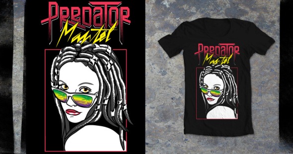
Once upon a time Rock Band hit the scene…all the kids were doing it. My buddy Jobin had just bought it and had some friends over. We needed a name. A name that said we will sing just as garbage as everyone else. I looked to his fireplace mantel where he had Predator figurines (dolls if you will). We became Predator Mantel for one night only.
The second design was for the World Wildlife Fund. Here it is.
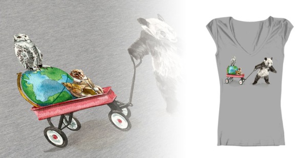
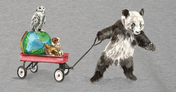
The idea was that we are in this together. With the overnight success of Ikea monkey, I decided to add him. Thought it was a nice shout out to Toronto.
If you’re down with these designs and would like to see them on some shirts, please click the images above to vote. You will more than likely have to sign up to the site but I’m pretty sure there is an option to not get notified by them. I’ve been signed up for a bit and they don’t seem to hastle me.
Ok so even if you hate these…sign up and vote for me by clicking the images above. My bank account will thank you if i win. Not by me giving you any money (heavens no) but you will sleep easy knowing I got paid.
Peace
and Happy Holidays
Punk Bird Update
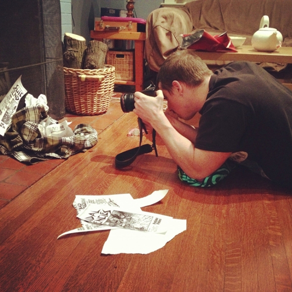
My last post was about helping my buddy Paul out with fundraising for his Birding Documentary Punk Rock Big Year. I said I was donating a punk inspired bird original art piece…here’s what I did.
Started with taking some reference photos, literally assembled a pile of garbage.
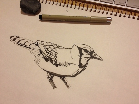
Drew a blue jay, and did a basic rough inking.
I then assembled it in the computer to make a transfer.
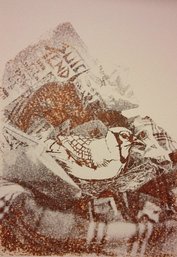
Took a couple tries though. I switched up the file a bit, changed printers, and the paper I was working on and it came out perfect.
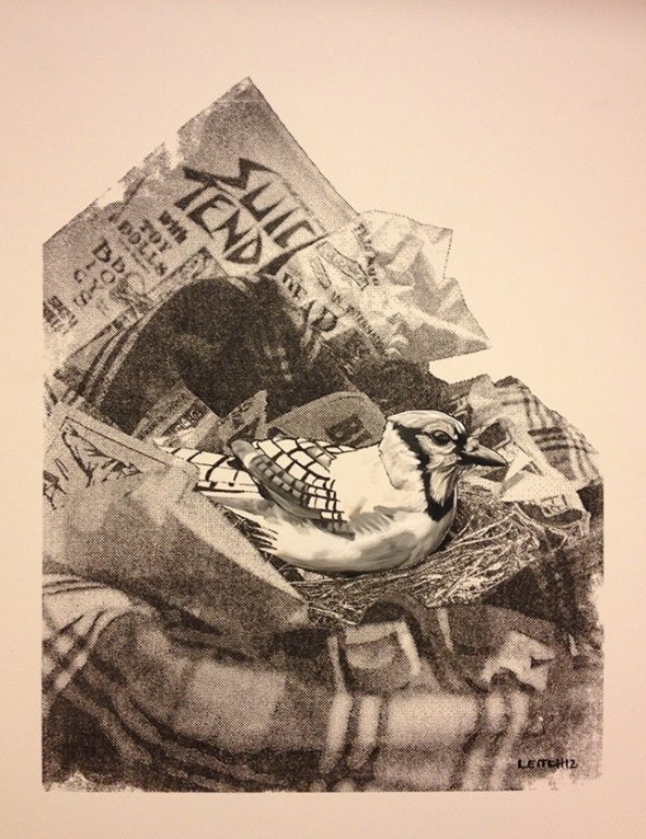
Last but not least, I hit it with a bit of oil painting to bring it all together. I wanted to keep a bit of the “marker/ink” look to the bird so I only added it mostly to the face and the underside.
Really happy with how this turned out. I tried to mix it up from my regular processes. My original idea was to paint a bird with a mohawk, but ended up going a different direction – I just made a nest out of plaid shirts, spraypaint caps, pins and band flyers.
Here’s the final:
Later
Helping Out My Fellow Man (or Lady;)
I have a buddy named Paul
Paul has a blog
Paul’s blog is Punk Rock Big Year
Sound familiar?????? A while ago I wrote a post about Paul being a birder.
He spent 365 days attempting to see as many different bird species as possible in Ontario, Canada and documenting it. Oh ya, he’s also getting every sighting he had last year tattooed onto him (Latin name of each). Paul’s trying to show birds are cool, birding is cool, and we need to help them from being endangered.
He basically funded the filming himself. There are countless hours of footage to go through, and without the help of a few post-production professionals, producing this doc would be impossible.
He has set up page on indiegogo with perks at different levels to help raise funds.
I asked Paul how I could help out and he asked if I could donate a piece of bird art. I said sure.
Over the last few years since I started making fine art again (2007-present) I’ve drawn, painted, photographed, and dribbled paint to make a few birds and smeared it around with a stick.
Here are some examples of my past bird work:


It’s not going to look exactly like all of these, but it will be awesome…
the LAST person to donate to Pauls documentary (tonight 11:59 it ends) will get a punk inspired bird original art piece by myself….. say what SAY WHAT!!!!! (you must pay shipping for the piece – unless you live in the GTA I’ll drop it off).
So if you can spare a couple bucks and want to try your hand at getting some art dontate here
A Random Thought
I’m really not sure what came over me, but after almost a year of not painting anything, I pulled out my only blank canvas and started messing around. I decided to only use red, yellow and blue paint with white. Here’s the progression.


I wasn’t giving too much thought about the colours I was using, but tried to just get the tones I wanted.


As soon as I had the hair in I hated it. I liked the colour, but to me it just looked whack. The ends of the hair were more defined than up near her face, and her collar bones looked like they were bursting through her chest. So I waited a week for it to dry, and hit it again last night while watching The Dark Knight.

I’m way happier with it now. The hair bleeds back into the image at the bottom instead of just sitting on top, and it covers up more of her body.
It felt good painting again. I think I might try more often to just sit down and start and see where it takes me.
R.F.A.
Brad
Time McFlys
Feel free to blast this track while reading – The Power of Love
The Summer’s almost coming to and end. Geeeeezze where did the time go. The year started out with me deciding to take a step back with my fine art and reevaluate where I’m going with it all. I made a plan to first update my portfolio which hadn’t been touched in over five years. Then work got in the way. About three solid months that turned into a blur, combined with some freelance design work, followed by a “I don’t want to do anything” hangover has pretty much brought me to the present.
I can’t say it was all work and no play. Part of the hangover was just chillin and reconnecting with friends and family. I went to a few talks and I saw all kinds of art.
From seeing Picasso a few times to Coeur De Lion Textiles beautiful representation for the National Ballet of Canada’s The Tutu Project.

Ben Sellick’s Solo Show

Kestin Cornwall’s Solo show

Karen Abel’s Installation at EiM Gallery

and Most Recently Seeing Brian Hoang, Jillian Newland, Zen Rankin, and Thadeus Maximus at Fan Expo Canada

I’ve watched a pile of documentaries some on the world, some on art. Last week I watched Crumb – A flick about the controversial comic book writer/artist and his family…pretty crazy stuff. As the fall quickly approaches I’m chipping away at my portfolio once again, thinking about finishing old projects and planning some new ones. I finished the plan for a mural I’m working on the other day. I’m not quite sure if I will start on it now or in the new year.

I have read The Artist’s Way which says you should write out your thoughts every morning to get rid of all the garbage in your head to open you to your creativeness. I haven’t read it yet, but theres a book called Steal Like An Artist which sounds like its saying to “borrow” your ideas. At some point recently I saw, or heard, or read (can’t remember the source) that to be producing great art you need to be obsessive about it, to be living it. I’m sure they’re all right.
That’s it for me…back to work.

Grinding Out The Details
I would be lying if I said every time I sit down to work on a project/painting/anything I kill it from start to finish. The pinup illustration I did for Easy Tiger Records was one of those occasions where I had my own personal stops and starts to get to the final image.
I started out with a few roughs showing different positions the pinup could be in.

From there, two roughs were taken to a colour rough with text placement.

The pose where the model is saluting was chosen to move to final linear.

The guys at Easy Tiger felt the first linear above had a face that was too aggressive and wanted a softer and more wide eyed look.

From there I transferred it to paper and began water colour painting it to get that vintage look. Not far into it, I decided this just wasn’t going to be the look I was trying to achieve. I would ultimately have to digitally tweak the water colour image to get the desired result. I decided to scrap the water colour and move to a digital painting. It’s actually been close to five years since I’ve done a digital painting. This took some extra time but it was well worth it.

This is when the good, the bad, and the ugly showed up. The good – I realized this was exactly the look we wanted. But I’d realized that there were aspects of the original drawing that were somewhat off. The pinup’s bent leg was massive. If you look above the red outline shows the original drawing overtop of the final proportions. I brought the leg in quite a bit and changed the bust to be more natural. Also, I changed the shape of the dress.
Here’s the final:

I’m really happy with how it turned out. I’m not giving up paining by any means but I might have to do a little more of these in the future.
Check Out This Show: Ben Sellick
I have been working my ass off at my real job lately. Loads of overtime. So nothing art related to update you on that’s my work. But I have made some time to get take in some art.
Last week I made a quick stop at Awol Gallery to see their Season Opener Garrison Creek Bat Co. show. It was packed so I didn’t so I bounced after only being there a little bit.
On Saturday I made it out to the Picasso exhibit at the AGO before it opened to the public. Morgan and I are members and free preview tickets are an awesome perk of the membership. The place was rammed. Pretty nice set of his work so I’m going to check it out again in couple of weeks.
This week I’m going to check out a good friend of mine’s show. Ben Sellick is presenting a retrospective of 10 years worth of art. I’ve been chatting with him while he’s been gearing up for this, and I know he’s put his heart into this show.

He’s a sick artist and has been chosen by #Hashtag Gallery’s to exhibit in their first solo showing (they opened a only few weeks ago.)
Details:
- Ben Sellick: A Retrospective
- Grand Opening: Thursday May 3rd 7pm
- #Hashtag Gallery, 801 Dundas Street West, Toronto
- Click here for Facebook Event
Hope to see you there.
The Only Time
Man I have been so busy lately. I just finished another class yesterday at OCAD – video editing. I’m now two credits into my media certificate. I’ve decided to take the summer off. The summer is the best time for me to work on my own projects since I can work outside.
I’ve also been doing some graphic work for clients, which has kept me really busy.
Last week I was uploading some of the last good pics I had to Flickr and I realized I hadn’t been out to shoot in a very long time.
The only time I could find to shoot was early in the morning. Last Thursday I woke up at 5am to go shoot while the sun was rising, tried to do a time lapse. Not going to lie it turned out like shit. But as my latest self help tape says – it takes 10,000 hours to become an expert. At least the temperature is going up these days. I froze my ass off at 5am.

I’m looking forward to having my weekends back now that school is over and I’m sure I’ll be getting into lots of personal project soon. I’ll update what’s happening here.
Final First Draft
Life’s been pretty busy lately. I finished my course on after effects a couple of weeks ago. It went well. I didn’t get exactly where I had wanted to with my final animation. I spent the majority of my time drawing up all the elements to animate and had plans for more effects then there are now. Here’s what I completed for the last class…
I’m really happy with it as a first rough cut. I say rough because there are some changes I want to make. I’m not quite happy with how some areas are moving, I want to add details like lightning flashes, and I need to finish the rest of the animation I had planned. I’m really psyched to finish, but (as most things) it’s going on the back burner for a few weeks.
I’ve still been working away with Easy Tiger Records and everything is really starting to take shape.
The biggest project I’m working on right now is a new portfolio. I haven’t updated it in 5-ish years. With my design work, photography, and fine art all spreading in different directions. I need to make tough decisions on what it is I’m aiming for. Its not like I don’t put my flavour on everything I do but at one point in my life I drew sperm for textbooks and other times I made graphics for 5 year olds. Might be interesting though having a page of sperms attacking a dinosaur.
Come To Podcamp: Social Media And Artists
Today I’m allowing Morgan to take up space on my blog and I’m telling you about her Podcamp session. It was going to be OUR Podcamp session but I read my schedule wrong for school and I have my final class and presentation this Saturday.
Podcamp is a free “unconference” on social media that happens every year. It will take place this Saturday and Sunday.
Morgan will be representing The Art of Leitch as a speaker this weekend. Her presentation is on artists using social media. It’s meant to be a discussion. She will present some of the thoughts behind The Art of Leitch’s online strategy, as well as what she’s learned from her own online experience.
Her online track record:
- blog averages 10,000 pageviews per month
- over 3000 Twitter followers
- Facebook fan page, Pinterest account, and YouTube channel
- she’s advised many bloggers on their online marketing strategy
- she’s works with health and fitness brands as on online influencer
The Art of Leitch’s online strategy is information and techniques that Morgan knows from her experience and the idea that I have about how I want to be represented online.

These two opinions brought up a lot of conversations about how I want the internet to view my art and me as an artist. THIS is the idea of the session that she’s presenting:
What social media channels should artists use? What should be shared online? Are there copyright concerns? What about sharing the process through blogging? What does Flickr do for artists and photographers? And there’s Tumblr, Instagram, Pinterest, Google +, Facebook, Twitter, etc. etc. etc.
Come and see what your peers are doing. Ask questions. Throw out ideas. This session is meant to be a discussion where we can all help each other.
Podcamp Details:
- Discussion: Social Media for Artists
- 2:45pm Saturday February 25th
- Ryerson University at Rogers Communication Centre (80 Gould St – across from Metro)
- FREE
- see all the Podcamp details here (you should check out all the sessions, it’s a two day event)
email her if you have any questions morgan.shuker AT gmail.com
Easy Update
One of the dope projects I’ve been working on lately has been the rebranding of Toronto indie record label, Easy Tiger Records. One of my first blog posts was about one of their bands, Wildlife. The company has had a great year so they felt it was time to re-brand/update their company image to reflect what a dynamite label they are. This was their original logo which ultimately they decided they wanted to update rather than start fresh.
![]()
They wanted a more hand drawn feel, to balance out the overall design, as well as pay some respect to the year they were established, and the great city they live in.

This is how it turned out. It was hand drawn with a white space added to the upper to lighten the weight of it. An established date was added in the middle to break up some of the negative space. The lower half really shows the hand drawn feel with the script looking less like it was done with a computer, and the filigree was made more organic with line weights that matched other areas of the design. Finally Toronto was slid in at the bottom inspired by old bank notes.

Along with the main logo, there’s some more logo work and imagery we’ve been working on. I’ll post again soon about this project when everything is finalized, and is rolled out on their new site.
Lates
The Re-Animator
As promised I’m following up on last weeks post about my After Effects class. My assignment is to create a 30 second piece. Not about anything in particular just to show that we can make some stuff move. My original idea was to create an opening logo animation like a movie studio for future YouTube videos, but I didn’t think that would fill the 30 seconds. Then I thought I could make a little video starring my logo character. This is what I came up with.

It shouldn’t be too hard to make this work, it will just be a lot of drawing and prepping all of the different layers needed. Just to help myself out a bit I ran to a Toronto graveyard today to snap a few pics of headstones and take a bit of video for reference.

I lucked out a bit because one of the best graveyards in the city is next to my buddy Trevor’s house, so I dropped in for a beer and caught a bit of the all star game.
Anyone know of any good After Effects how-to sites or tutorials that will help me with my final project?
Getting A Makeover
Amongst some of the really cool projects I’ve been doing in January, I’ve been working on my retouching skills. I have taken classes and followed along with video how tos, but had yet to sit down and actually work on some pics from start to finish. Here’s the pic I ended up going with.

BEFORE ... Click photo for AFTER
It really doesn’t do justice for this pretty model and the photographer who took it. It is entirely too dark and brings out every imperfection on her skin. It was one of the worst images of the shoot, so I purposely chose it to work on. In reality this photo would have hit the cutting room floor, but it had a great composition and I really enjoyed the engagement you get when you look in her eyes.
To check out the after click the image.
In other news I had my second after effects class this week where I got my first homework assignment… Create storyboards for your final 30sec film. Been thinking all day about what I want to do and I think I’m starting to narrow it down, so next week I’ll blog about what I came up with.
New Beginnings
The last few weeks have really flown by for me. I’ve been working on a few projects for clients and a few for myself. I had such a great 2011 both with my personal life and my art that 2012 will have more great progress as well as opportunities. I have been thinking a lot about how I want the year to play out for me and my art. I’ve gone back to school at OCAD for a Continuing Studies Program. My first class is an intro to After Effects which I’ve wanted to learn for a few years now. So with the decision to go back to school and focus on refining what I had started last year I have realized that I don’t have enough hours in the day to dedicate to painting. It blows to think this but at the end of the day I’m just not a full-time artist. I will still be looking for shows to participate in and working on new projects, but these will be more focused on design. I’ll post about these as well as my school projects.
Four full-time artists that I got a chance to hang with before the holidays were local artists, Kelly Grace, Shaun Downey, Kyle Stewart and Gosia in their new studio at Queen & Carlaw in Toronto.

It was their official studio opening with art for sale, music, drinks, and food.


I had such a great time hanging out and as usual I wish I had taken more pics of the party, I really only captured Gosia’s corner of the room. It was very inspiring just walking around the space checking out what everyone had been up to and knowing they too were going to have a great year ahead of them.
Drive To The Muppets With Angelo Pappas

Checked out the new Muppet Flick last week and it was pretty dope. It is by far the best movie they have put out in years. If you were a fan back in the day and catch pixar movies even though you don’t have kids, you will probably digg it….if not then don’t bother because it is a kids movie…go watch Drive….then rob a bank…then go skydiving….then surf.
Brownie 2: The Mustache Returns
Saturday I hit up The Toronto’s Art Brownie Shop Exhibition at INDEXG to check out how everything turned out. Pretty nice little shop and gallery space they have going there.  When I arrived it was pretty tight with all the people checking the show, which was nice to see. The pic below is of the shop side (I forgot to grab one of the gallery side).
 Me rocking my new look.
 Thanks to everyone who made it out. The show goes on till the end of the year so if you’re around Gladstone Ave drop in.
There’s Brownie In My Stash
A couple of weeks ago Claire talked me into doing a couple of Art Brownies for a show November 19th at INDEXG. What’s an Art Brownie? An Art Brownie is “a small art piece. A wooden block measuring 2.5 inch square, 1.5 inch in height. Artist works on it as a mini canvas.”
Here’s what I came up with
I forgot to photograph them before dropping them off so I was pretty lucky to see they had some of the blocks photographed and being displayed on their site.
Here’s the show poster
 Many artists are involved so stop by and say hi (to me or my mustache), grab some brownies, cost ranges between $30 – $100.
Lates